Module: Toolbar
An extension can register a Toolbar Module by defining a getToolbarModule
method. OHIF-v3's default extension ("@ohif/extension-default") provides the
following toolbar button uiTypes:
ohif.radioGroup: which is a simple button that can be clickedohif.splitButton: which is a button with a dropdown menuohif.divider: which is a simple divider
Example Toolbar Module
The Toolbar Module should return an array of objects. There are currently a
few different variations of definitions, each one is detailed further down.
There are two things that the toolbar module can provide, first
a component, and second evaluators.
Components
export default function getToolbarModule({ commandsManager, servicesManager }) {
  return [
    {
      name: 'ohif.radioGroup',
      defaultComponent: ToolbarButton,
      clickHandler: () => {},
    },
    {
      name: 'ohif.splitButton',
      defaultComponent: ToolbarSplitButton,
      clickHandler: () => {},
    },
    {
      name: 'ohif.layoutSelector',
      defaultComponent: ToolbarLayoutSelector,
      clickHandler: (evt, clickedBtn, btnSectionName) => {},
    },
    {
      name: 'ohif.toggle',
      defaultComponent: ToolbarButton,
      clickHandler: () => {},
    },
  ];
}
Custom Components
You can also create your own extension, and add your new custom tool appearance
(e.g., split horizontally instead of vertically for split tool). Simply add
getToolbarModule to your extension, and pass your tool react component to its
defaultComponent property in the returned object. You can use @ohif/ui
components such as IconButton, Icon, Tooltip, ToolbarButton to build your own
component.
import myToolComponent from './myToolComponent';

export default function getToolbarModule({ commandsManager, servicesManager }) {
  return [
    {
      name: 'new-tool-type',
      defaultComponent: myToolComponent,
      clickHandler: () => {},
    },
  ];
}
Check out how to assemble the toolbar in the modes section.
Evaluators
Buttons may be equipped with evaluators, which are functions invoked by the toolbarService to assess the button's status. These evaluators are expected to return an object of {className} and may include additional details, as elaborated in the subsequent section.
Evaluators play a crucial role in determining the button's status based on the viewport. For example, users should be restricted from clicking on the mpr if the displaySet is not reconstructable. Additionally, certain buttons within the toolbar may be associated with specific toolGroups and should remain inactive for certain viewports.
Let's look at one of the evaluators (for evaluate.cornerstoneTool)
 {
  name: 'evaluate.cornerstoneTool',
  evaluate: ({ viewportId, button }) => {
    const toolGroup = toolGroupService.getToolGroupForViewport(viewportId);

    if (!toolGroup) {
      return;
    }

    const toolName =  toolbarService.getToolNameForButton(button);

    if (!toolGroup || !toolGroup.hasTool(toolName)) {
      return {
        disabled: true,
        className: '!text-common-bright ohif-disabled',
        disabledText: 'Tool not available',
      };
    }

    const isPrimaryActive = toolGroup.getActivePrimaryMouseButtonTool() === toolName;

    return {
      disabled: false,
      className: isPrimaryActive
        ? '!text-black bg-primary-light'
        : '!text-common-bright hover:!bg-primary-dark hover:!text-primary-light',
    };
  },
},
as you can see the job of this evaluator is to determine if the button should be disabled or not. It does so by checking the toolGroup and the toolName and then returns an object with disabled and className properties.
Various information can be returned by an evaluator. In particular...
disabled: flag indicating if the tool should be disabled or notdisabledText: the text or tooltip to show if thedisabledflag above is set totruevisible: flag indicating if the tool show be visible or not; this is a convenient way to force a tool to hide based on some custom (evaluator) logicisActive: flag to indicating where the tool is currently active or notclassName: custom CSS class names to add to the tool's component
The following evaluators are provided by us:
evaluate.cornerstoneTool: If assigned to a button (see next), it will make the button react to the active viewport state based on its toolGroup.evaluate.cornerstoneTool.toggle: It is designed to consider tools with toggle behavior, such as reference lines and image overlay (either on or off).evaluate.cornerstone.synchronizer: This is designed to consider the synchronizer state of the viewport, whether it is synced or not.evaluate.viewportProperties.toggle: Some properties of the viewport are toggleable, such as invert, flip, rotate, etc. By assigning this evaluator to those buttons, they will react to the active viewport state based on its properties. This allows for dynamic buttons that change their appearance based on the active viewport state.evaluate.mpr: special evaluator for MPR since it needs to check if the displaySet is reconstructable or not.
Sometime you want to use the same evaluator for different purposes, in that case you can use an object
with name and other properties. For example, in 'evaluate.cornerstone.segmentation' we use
this pattern, where multiple toolbar buttons are using the same evaluator but with different options (
in this case toolNames
)
{
  name: 'evaluate.cornerstone.segmentation',
  toolNames: ['CircleBrush' , 'SphereBrush']
},
Viewport and Modality Support Evaluation
The toolbar system now uses a more robust approach for evaluating button states based on viewport types and modalities:
Viewport Type Support:
Use evaluate.viewport.supported to disable buttons for specific viewport types:
{
  name: 'evaluate.viewport.supported',
  unsupportedViewportTypes: ['volume3d', 'video', 'sm']
}
Modality Support:
Use evaluate.modality.supported to control button state based on modalities:
{
  name: 'evaluate.modality.supported',
  supportedModalities: ['CT', 'MR'],  // Enable only for these modalities
  // OR
  unsupportedModalities: ['US']       // Disable for these modalities
}
Composing evaluators
Multiple evaluators can be combined to create complex conditions:
evaluate: [
  'evaluate.cine',
  {
    name: 'evaluate.viewport.supported',
    unsupportedViewportTypes: ['volume3d']
  },
  {
    name: 'evaluate.modality.supported',
    supportedModalities: ['CT']
  }
]
This evaluation system provides more precise control over when toolbar buttons are enabled or disabled based on the active viewport's characteristics.
You can choose to set up multiple evaluators for a single button. This comes in handy when you need to assess the button according to various conditions. For example, we aim to prevent the Cine player from showing up on the 3D viewport, so we have:
evaluate: [
  'evaluate.cine',
  {
    name: 'evaluate.viewport.supported',
    unsupportedViewportTypes: ['volume3d'],
  },
],
You can even come up with advanced evaluators such as:
evaluate: [
  'evaluate.cornerstone.segmentation',
  // need to put the disabled text last, since each evaluator will
  // merge the result text into the final result
  {
    name: 'evaluate.cornerstoneTool',
    disabledText: 'Select the PT Axial to enable this tool',
  },
],
that we use for our RectangleROIStartEndThreshold tool in tmtv mode.
As you see this evaluator is composed of two evaluators, one is evaluate.cornerstone.segmentation which makes sure (in the implementation), that
there is a segmentation created, and the second one is evaluate.cornerstoneTool which makes sure that the tool is available in the viewport.
Since we are using multiple evaluators, the disabledText of each evaluator will be merged into the final result, so you need to
put the disabledText in the last evaluator.
Group evaluators
Split buttons (see in ToolbarService on how to define one) may feature a group evaluator, we provide two of them and you can write your own.
evaluate.group.promoteToPrimaryIfCornerstoneToolNotActiveInTheList: determine the outcome of user interactions with the split buttons on what button should be promoted to the primary section. In the example above, the cornerstone tool's status is checked, and if it is not active in the list of buttons, the button is promoted to the primary section.evaluate.group.promoteToPrimary: disregarding the cornerstone tool's status and promoting the button to the primary section regardless.
Failure to specify a group evaluator will result in no action, leaving the button in the secondary section.
As you have learned so far, the extension modules only 'provides' the functionality and it is the mode's job to consume it. You can next learn how to consume these components and evaluators to build a toolbar in the
Custom Evaluators
You can create your own evaluators. For instance, you have the option to design tri-state buttons, which are buttons with three states such as Show All, Show Some, or Show None of the Viewport Overlays.
Toolbar buttons consumed in modes
Providing just the components is not enough. You need to add the buttons to the toolbar service and decide which ones are used for each section.
Below we can see a simplified version of the longitudinal (basic viewer) mode that shows how
a mode can add buttons to the toolbar by calling
ToolBarService.addButtons(toolbarButtons). toolbarButtons is an array of
toolDefinitions which we will learn next.
function modeFactory({ modeConfiguration }) {
  return {
    id: 'viewer',
    displayName: 'Basic Viewer',

    onModeEnter: ({ servicesManager, extensionManager }) => {
      const { toolBarService } = servicesManager.services;

      toolbarService.addButtons([...toolbarButtons, ...moreTools]);
      toolbarService.createButtonSection('primary', [
        'MeasurementTools',
        'Zoom',
        'info',
        'WindowLevel',
        'Pan',
        'Capture',
        'Layout',
        'Crosshairs',
        'MoreTools',
      ]);
    },
    routes: [
      {
        path: 'longitudinal',
        layoutTemplate: ({ location, servicesManager }) => {
          return {
            /* */
          };
        },
      },
    ],
  };
}
By default OHIF's default layout (extensions/default/src/ViewerLayout/index.tsx) which is used in all modes use a Toolbar component that creates a
primary section for tools. That is why we are creating a primary section in the example above.
Layouts are also customizable, and you can create your own layout in your extensions and provide it to your modes view getLayoutTemplateModule module.
By default we use @ohif/extension-default.layoutTemplateModule.viewerLayout to use the default layout which provides a
- Header (with logo on left, toolbar in the middle and user menu on the right)
- Left panel
- Main viewport grid area
- Right panel
Alternative Toolbar sections
In your UI component, such as panels, you have the option to include a toolbar section template.
This allows you to easily add buttons to it later on. To ensure that the buttons are added properly
to the toolbar, respond to interactions correctly, and evaluate states accurately, simply utilize the useToolbar hook.
This hook grants you access to the onInteraction function and the toolbarButtons array, which you can customize within your UI as needed.
function myCustomPanel({servicesManager}){
  const { onInteraction, toolbarButtons } = useToolbar({
    servicesManager,
    buttonSection: 'myCustomSectionName'
  });

  // map the buttons to the UI
  return (
    <div>
      {toolbarButtons.map((button, index) => {
        return (
          <button
            key={index}
            onClick={() => onInteraction(button)}
          >
            {button.label}
          </button>
        );
      })}
    </div>
  );
}
We have provided a common component for toolbar buttons called Toolbox.
The Toolbox component serves as a versatile and configurable container for toolbar tools within your application.
It is designed to work in conjunction with the useToolbar hook to manage tool states, handle user interactions, and memorize options
using context API.
The Toolbox can be easily integrated into your application UI, requiring only the necessary services (servicesManager, commandsManager) and configuration parameters (buttonSectionId, title). Here's a simple usage scenario:
function MyApplication({ servicesManager, commandsManager }) {
  // Configuration for the toolbox container
  const config = {
    servicesManager,
    commandsManager,
    buttonSectionId: 'customButtonSection',
    title: 'My Toolbox',
  };

  return <Toolbox {...config} />;
}
Then in your modes you can edit the tools in that button section.
onModeEnter: ({ servicesManager, extensionManager }) => {
  const { toolBarService } = servicesManager.services;

  toolbarService.addButtons([...toolbarButtons, ...moreTools]);
  toolbarService.createButtonSection('customButtonSection', [
    'MeasurementTools',
    'Zoom',
    'info',
  ]);
},
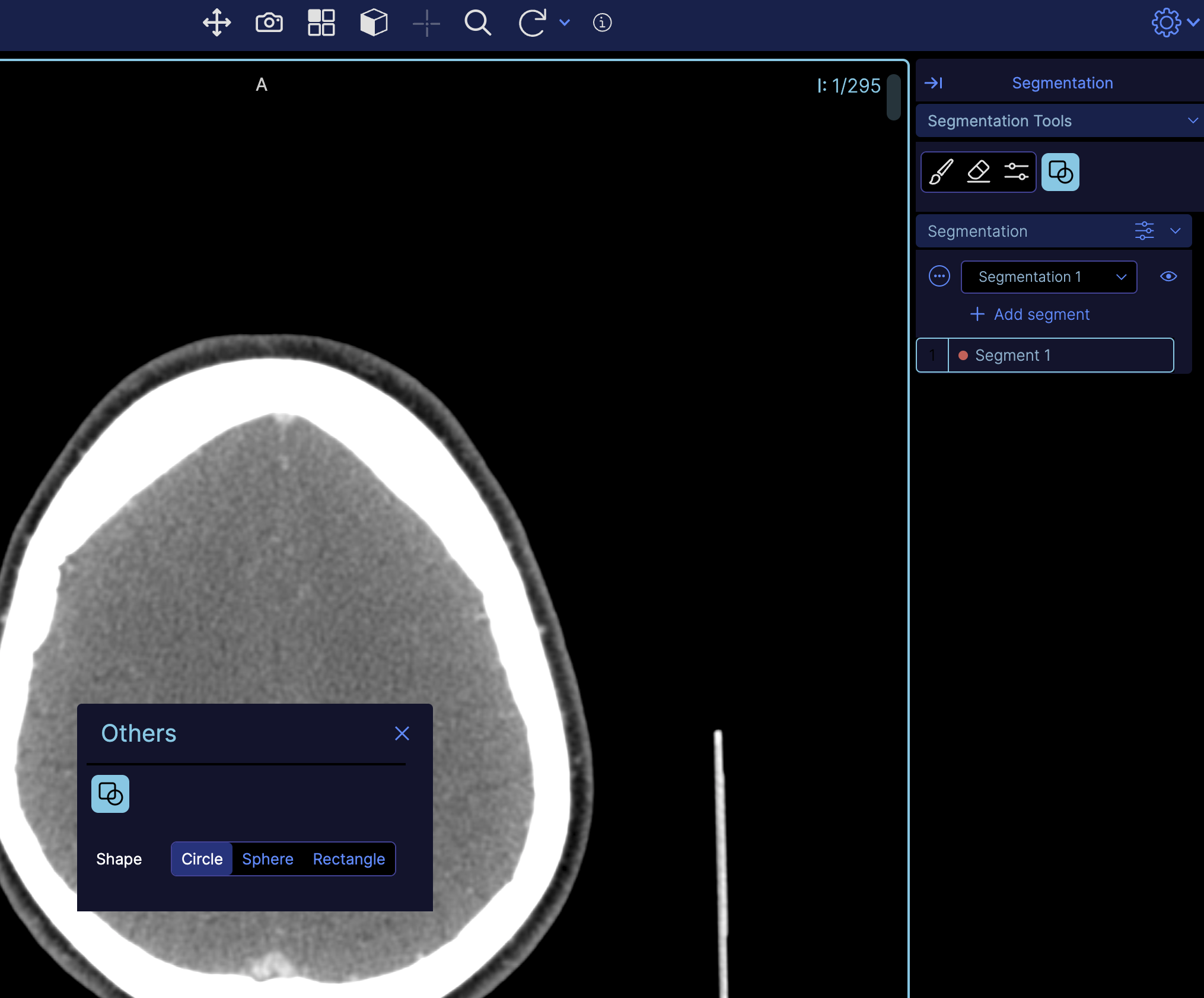
Another example might be you want to open a modal to show some tool options when a button is clicked. You can use this pattern
// ToolbarButton in mode
 {
    id: 'Others',
    uiType: 'ohif.radioGroup',
    props: {
      icon: 'info-action',
      label: 'Others',
      commands: 'showOthersModal',
    },
  },
and inside your mode factory
// adding the 'Others' button to the primary section
toolbarService.createButtonSection('primary', [
  'Others', // --------> this one
]);

// adding the shapes button to the 'Other' section
toolbarService.createButtonSection('other', ['Shapes']);
here as you see we are using a command showOthersModal which is defined in the commands module.
// inside commandsModule of your extension
 showOthersModal: () => {
      const { uiModalService } = servicesManager.services;
      uiModalService.show({
        content: OthersModal,
        title: 'Others',
        customClassName: 'w-8',
        movable: true,
        contentProps: {
          onClose: uiModalService.hide,
          servicesManager,
          commandsManager,
        },
        containerDimensions: 'h-[125px] w-[300px]',
        contentDimensions: 'h-[125px] w-[300px]',
      });
    },
as you see it is opening a modal with OthersModal component (below) which contains the
Toolbox component.
// Others modal
import { Toolbox } from '@ohif/ui';

function OthersModal({ servicesManager, commandsManager }) {
  return (
    <div className="px-2">
      <Toolbox
        buttonSectionId={'other'}
        commandsManager={commandsManager}
        servicesManager={servicesManager}
        title={'other'}
        useCollapsedPanel={false}
      ></Toolbox>
    </div>
  );
}
The result would be a modal with a toolbox inside it when the Others button is clicked, and the
state will get synchronized with the toolbar service automatically.
Toolbox With Options
Your toolbox toolbar buttons can have options, this is really useful for advanced tools that require to change some parameters. For example, the brush tool that requires the brush size to change or the mode (2D or 3D).
Toolbox with options will run the options commands on the mount of the toolbox component. This is useful for setting the initial state of the toolbox.
Currently we support three types of options.
Radio option
We use this in segmentation shapes to let the user choose between three different modes
{
  id: 'Shapes',
  uiType: 'ohif.radioGroup',
  props: {
    label: 'Shapes',
    evaluate: {
      name: 'evaluate.cornerstone.segmentation',
      toolNames: ['CircleScissor', 'SphereScissor', 'RectangleScissor'],
    },
    icon: 'icon-tool-shape',
    options: [
      {
        name: 'Shape',
        type: 'radio',
        value: 'CircleScissor',
        id: 'shape-mode',
        values: [
          { value: 'CircleScissor', label: 'Circle' },
          { value: 'SphereScissor', label: 'Sphere' },
          { value: 'RectangleScissor', label: 'Rectangle' },
        ],
        commands: 'setToolActiveToolbar',
      },
    ],
  },
},
Range option
We use this for brush radius change
{
  id: 'Brush',
  icon: 'icon-tool-brush',
  label: 'Brush',
  evaluate: {
    name: 'evaluate.cornerstone.segmentation',
    toolNames: ['CircularBrush', 'SphereBrush'],
    disabledText: 'Create new segmentation to enable this tool.',
  },
  options: [
    {
      name: 'Radius (mm)',
      id: 'brush-radius',
      type: 'range',
      min: 0.5,
      max: 99.5,
      step: 0.5,
      value: 25,
      commands: {
        commandName: 'setBrushSize',
        commandOptions: { toolNames: ['CircularBrush', 'SphereBrush'] },
      },
    },
  ],
},
Custom option
We use this pattern inside tmtv mode for RectangleROIThreshold
{
  id: 'RectangleROIStartEndThreshold',
  uiType: 'ohif.radioGroup',
  props: {
    icon: 'tool-create-threshold',
    label: 'Rectangle ROI Threshold',
    commands: setToolActiveToolbar,
    evaluate: {
      name: 'evaluate.cornerstoneTool',
      disabledText: 'Select the PT Axial to enable this tool',
    },
    options: 'tmtv.RectangleROIThresholdOptions',
  },
},
Note that it is your job to provide the tmvt.RectangleROIThresholdOptions in the getToolbarModule of your extension
Change Toolbar with hanging protocols
If you want to change the toolbar based on the hanging protocol, you can do a pattern like this.
 const { unsubscribe } = hangingProtocolService.subscribe(
  hangingProtocolService.EVENTS.PROTOCOL_CHANGED,
  () => {
    toolbarService.createButtonSection('primary', [
      'MeasurementTools',
      'Zoom',
      'WindowLevel',
    ]);
  }
);